
.png)
Anatomy of a Brand Colour Palette
- Jan 30
- 4 min read
Updated: Feb 3

What is a brand colour palette?
The anatomy of a brand colour palette is a set of colours chosen to represent your business visually. These colours appear on your logo, website, packaging, and marketing materials. The palette usually includes:
Primary colours: The main colours that define your brand’s look.
Secondary colours: Supportive colours that complement the primary ones.
Accent colours: Used sparingly to highlight important elements.
Together, these colours create a consistent visual language that customers recognise.
Why the anatomy of a brand colour palette matters
A carefully selected colour palette does more than make your materials look attractive. It helps your business:
Build recognition: Consistent use of colours makes your brand easier to remember.
Communicate personality: Colours convey feelings and traits, like trustworthiness or creativity and resonate with your ideal client.
Guide customer decisions: Certain colours can encourage actions, such as buying or signing up.
Create harmony: A balanced palette ensures your visuals are pleasing and professional, helps prevent overstimulating (visually uncomfortable) or under stimulating (boring).
For example, a health-focused brand might use calming blues and greens to suggest safety and wellness, while a children’s toy company might choose bright, energetic colours to attract attention and excitement.
Other examples can be used to disrupt their industry such as Octopus Energy chose their vibrant, high-contrast colour palette—specifically their signature magenta (pink) and deep blue—to intentionally disrupt the traditional, dull branding of the "Big Six" UK energy suppliers. Another example of this is easyjet.
Key elements of a successful colour palette
1. Balance between colours
A good palette balances bold and neutral colours. Too many bright colours can overwhelm, while too many neutrals may feel dull. Aim for:
One or two strong primary colours
Two to three secondary colours that blend well
One or two accent colours for highlights
This balance keeps your visuals interesting without causing confusion.
2. Colour harmony and contrast
Colours should work together harmoniously but also provide enough contrast to make important elements stand out. Using colour theory basics helps:
Complementary colours: Opposite on the colour wheel, they create strong contrast.
Analogous colours: Next to each other, they offer smooth transitions.
Triadic colours: Evenly spaced around the wheel, they provide vibrant balance.
For example, pairing a deep navy blue with a warm orange accent creates eye-catching contrast while maintaining harmony.
3. Reflecting brand personality
Colours carry meaning and emotion. Choose colours that match your brand’s values and personality. Here are some common associations:
Blue: Trust, calm, professionalism
Red: Energy, passion, urgency
Green: Growth, health, nature
Yellow: Optimism, warmth, creativity
Black: Sophistication, power, elegance
Think about what you want customers to feel when they see your brand and select colours that support that message.
4. Versatility across platforms
Your palette should look good in different formats and sizes, from business cards to websites. Test colours in:
Print materials
Digital screens
Merchandise
Make sure colours remain consistent and readable in all uses.
How to create your brand colour palette
Step 1: Start with your primary colour
Pick one colour that best represents your business. This will be the foundation of your palette. Consider your industry and target audience. For example, a financial advisor might choose blue for trust, while a bakery might pick warm brown or pink tones.
Step 2: Add secondary colours
Choose two or three colours that complement your primary colour. These will be used for backgrounds, secondary text, or supporting graphics. Use colour harmony rules to find combinations that work well.
Step 3: Select accent colours
Pick one or two accent colours for buttons, calls to action, or highlights. These should contrast with your primary and secondary colours to draw attention.
Step 4: Test and refine
Create mockups of your website, packaging, or social media posts using your palette. Check how the colours look together and adjust if needed. Ask for feedback from customers or colleagues.
Example of an effective brand colour palette
Airbnb: Combines a warm coral with soft pinks and greys, creating a welcoming and friendly vibe.
This palette is simple but carefully balanced to reflect the brand’s personality and purpose.
Common mistakes to avoid
Using too many colours, which can confuse customers.
Choosing colours that clash or are hard to read.
Ignoring how colours appear on different devices or materials.
Selecting colours based only on personal preference, not audience or message.
Final thoughts
"A well curated colour palette is a powerful
tool for small business owners. "
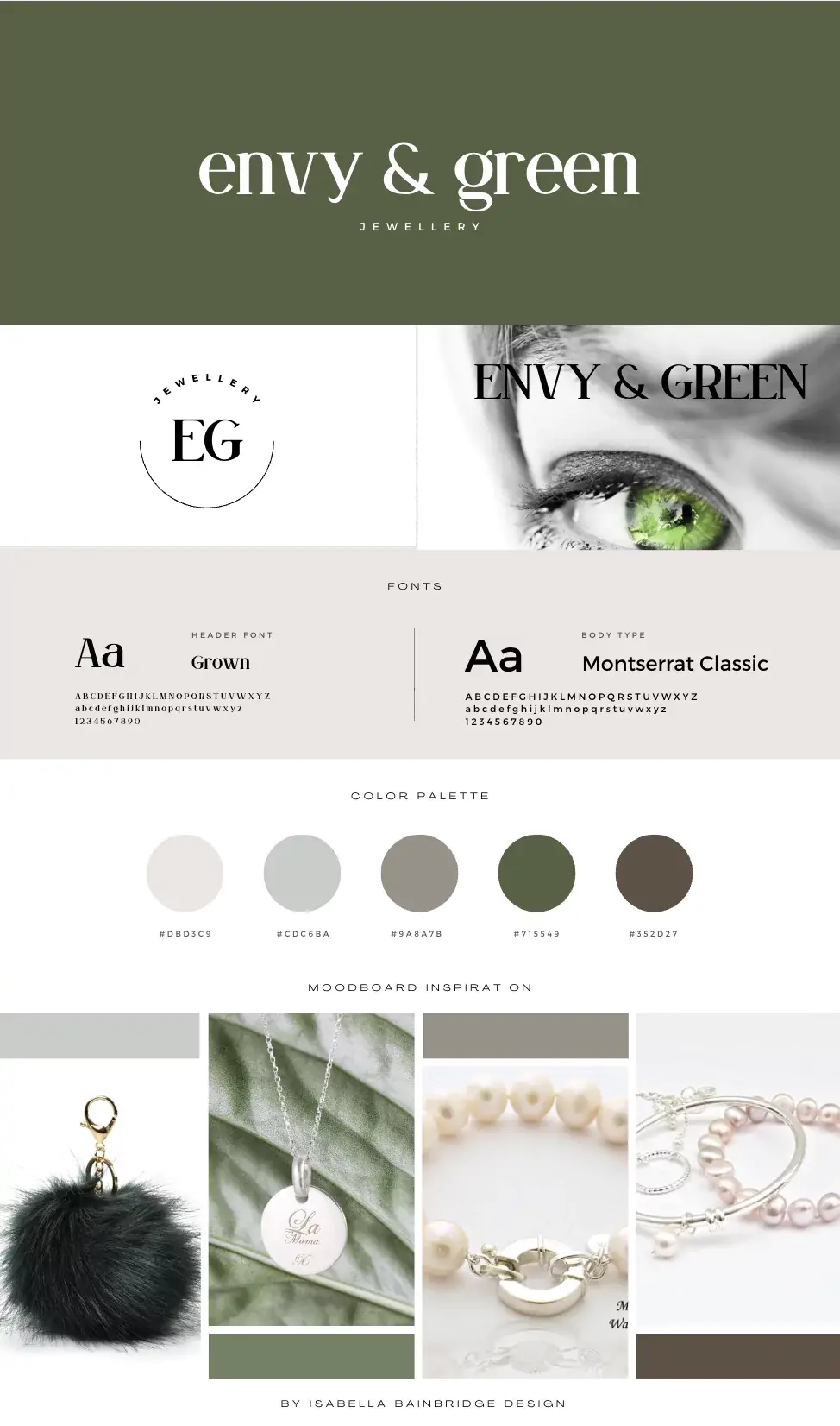
for example designs...
or scroll down to see example at the end of this blog


Content is the Queen Bee… it's the reason your customers love you...
Write your content with personality + identity, it becomes the dna that's woven through everything you do!
“Personality is the mysterious force that attracts us to certain people and repels us from others. Because personality greatly influences our decision-making process, it can be a powerful tool in design.” — Arron Walter, co-host of Design Better and author of Designing for Emotion


Comments